


Client Situation
Preparation
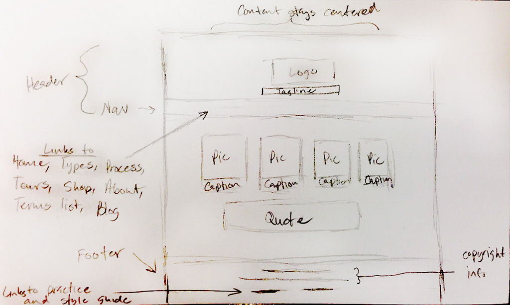
Part 1 Instructions: Sketches
BRAINSTORM AND SKETCH.
Formulate a Plan
Formulate a plan. Determine the message(s) of the website, consider the demographics of the audience, and start sketching ideas to communicate that message to the audience. Be sure to include all the home page elements listed below. Be sure you label each element as shown in this example. Take a photo (phone pic is fine) of your best sketch to submit.
Name the image according to the following format: 11A-Sketch-JakeSpencer.jpg
Include these elements in your Sketch Click sketch example below to view larger…
• Header
• Logo
• Navigation (with link names for 6-10 pages)
• Boxes for images
• Boxes for text
• Labels (images, text, links, copyright, etc.)
• Footer
• Any other key elements
Part 2 Instructions: Shape Map (Wireframe)
Designers call it a shape map, mockup, or digital sketch. Web developers may call it a wireframe.
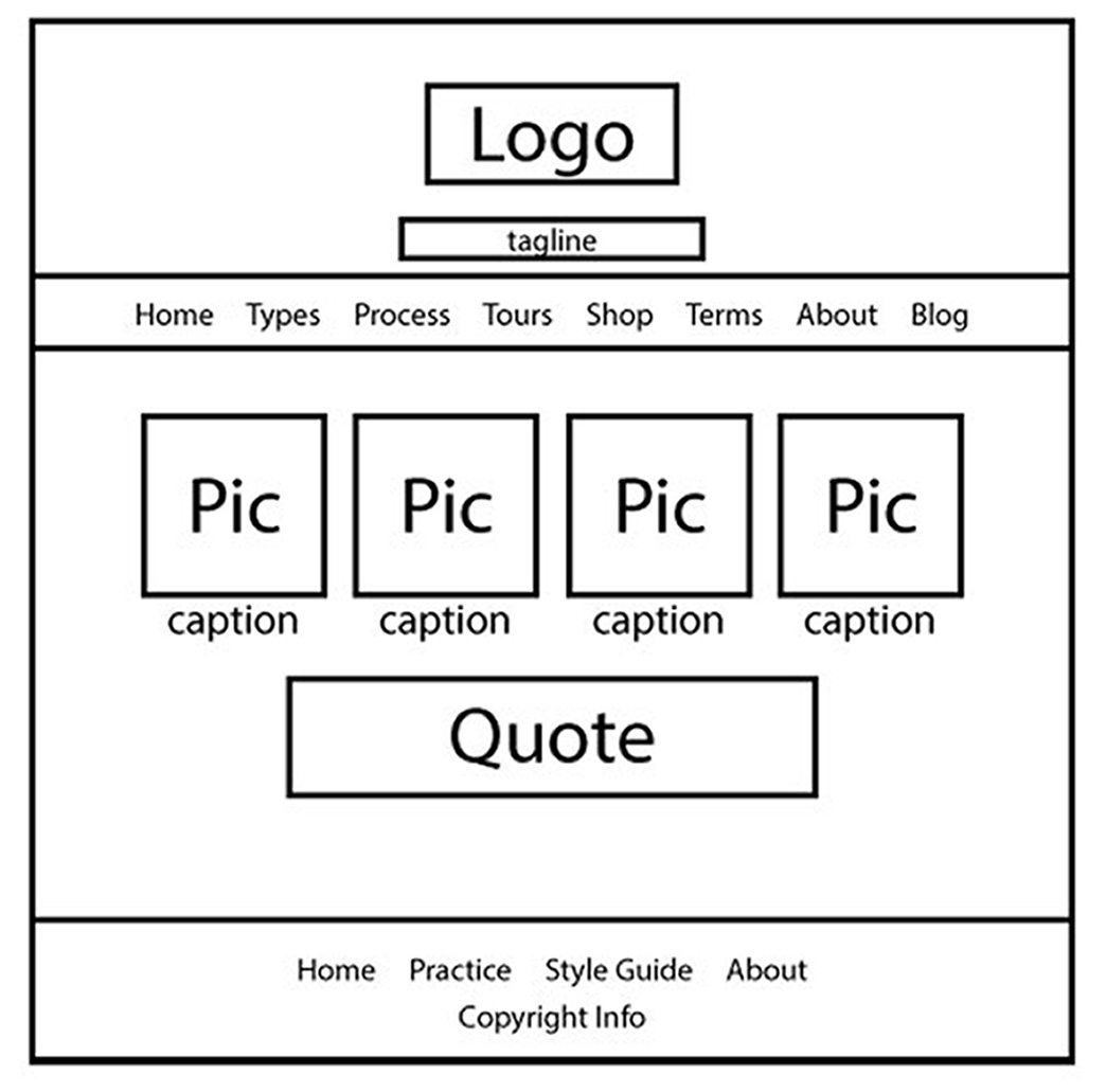
1. LAYOUT
Organize the layout
Use your sketch to create a digital “Shape Map” in Photoshop. The width of your document should be 960 pixels. The length is up to you, depending on how much scrolling you want on your home page. You can always add more to the canvas size (Image—Canvas Size.) Consider your negative and positive space and be sure to group your related items together for good proximity. And alignment is paramount for good web design. Include all the same elements and labels in your Shape Map that you had in your Sketch. See list above and see example above (click to enlarge). Save your file as a .psd for future editing. Then also save the file according to the following format: 11A-ShapeMap-JakeSpencer.jpg.
Note: It’s a good idea to stay organized with folders and layers in Photoshop. Make sure you name each layer with a title so you know what it is (double click the layer name to change it) and even use folders to group layers that are similar together. (In the layers pallet, at the bottom, there is an icon that will allow you to create a new folder. Then click and drag layers into that folder.)
2. STYLE GUIDE
Contrast the Elements
Now it’s time to create your “style guide” by selecting or creating your color scheme, typeface(s) and logo and images. Add a Style Guide box with color scheme, color names, swatches, typefaces, and categories.
It is critical to have captivating images on your page to communicate your message. Follow the “Finding images online” (Finding images online Transcript) tips or take your own photos. If you cannot find or create images that fit your color scheme, you have two choices:
1. Choose a new color scheme that works with available images, or
2. Change the color(s) in your images by using this “Replace Color” Photoshop tutorial. (Transcript)
Many designers find it best to create an “image based color scheme.” Try using your dominant image to eyedrop swatches of color, then study the color schemes that will work with your swatches.
Remember to use shades and tints by adding black and white to get more pleasing, muted versions of the colors, as needed. Get advice from the tutor or instructor if this is hard for you. The most difficult parts about visual design are color schemes, typography choices, and images sizing, so don’t be shy about asking for help. It is normal to feel overwhelmed when dealing with so many elements at once. That’s when talking to another designer, classmate, or helper is wise.
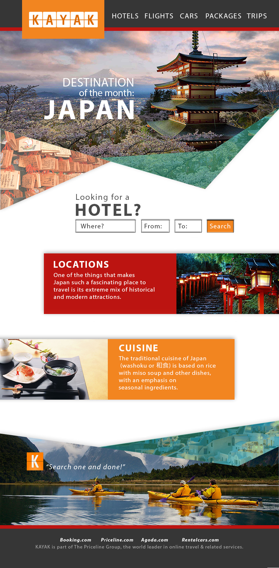
Part 3 Instructions: Web Page Prototype
1. GRID LAYOUT
Now your project comes alive!
Download this base Photoshop file by the 960 Grid System.
Your web developer has requested a grid layout, so click the link above, then download and unzip the folder. Use one of the column grids in the folder as a guide to lay out your design. The example at the right shows a 16 column grid. See helpful “grid” tips here and examples at 960 Grid System.
Your final layout should be a refined version of the shape map (wireframe) you created. It does not need to match exactly to your original sketch, it is okay if you make tweaks or changes throughout the processes.
2. WELL DESIGNED .PSD FILE
You will deliver the .psd file to the web developer as the web page prototype so he/she can use the layers and grid measurements, if needed. So be sure to follow the video tutorial below to place each item on their own layer and group similar layers in a folder. Label all layers and folders. Save the .psd file to preserve layers for future editing.
3. SAVE PDF FOR CRITIQUES
Hide the grid layer and save the file as a PDF from Photoshop to share your layout with evaluators. Gather critique from two class members, tutor/instructor at least one day in advance so you have time to make corrections.
Note: Avoid using smart layers when designing this layout in Photoshop. They often make your Photoshop document very large, and thus hard to upload/download. Your final PSD should not be over 5MB in size.
Finishing the Project
1. Critique Process – Find more details in Course > Critique Process Guidelines
1. Class Facebook Critique: Post jpeg or png by Monday 8:00pm MDST
2. Client Critique: Watch Instructor critique recording on Tuesday
3. Critique Report: Include in blog post: Who-How-What critique you received & list two students YOU critiqued.
2. Blog Post
Display your web page prototype image at Large display size at the top of your blog post. Then add the shape map and sketch images underneath and display them at medium or small, but be sure all your images are always clickable.
Add Written process: 5+ sentences (Include Message/Audience); Critique Report: 3+ sentences; links to image source(s); font name/category for title and copy; color scheme with color names. View the Sample Blog Post if you would like to see an example of a blog post.
3. Submission
Find more details in Course > Blog Post: Submission Instructions
2. Then you will be able to insert a working HYPERLINK to your blog.
Rubric
NOTE: Meeting the minimum requirements is “average” and constitutes an 80% or B- grade, according to the University Grading Guide. To receive a higher grade, students should excel.
√ Layout: Size: 960 px width; Quality images; Design principles; includes the content requirements; Design element;
√ Typography: Typography rules followed; contrasting typography; title; navigation menu; copyright information
√ Blog Post: three images displayed at Large size (quality JPEG of project; quality wireframe; quality sketches); images are clickable; Written process: 5+ sentences (message and audience listed); Critique Report: 3+ sentences (who, what, and applied); links to image source; font name/category for title and copy.
√ Submission: Screenshot of entire blog post, PDF of project and working hyperlink to blog post.
CAUTION: your assignment is not complete until you submit a link to it here. However, you are allowed a one-time extension, if you choose to use your mulligan. (See syllabus). We check your blog post for completion right at the deadline, so please do not add things after submitting your link, until it has been graded.